I found that there were very few well known music newspapers, although some newspapers do incorporate music there were very few that were dedicated to music as their main subject matter this is why I decided to focus on local music for my main subject matter. I also thought that it would be different to local newspaper which usually focuses on local news and events which I thought wouldn’t be of interest to the audience I wanted to aim my product at.
When researching newspapers and magazines I found a lot of information that I could use to create a newspaper that would appeal to my target audience. Because my target audience is young adults and teenagers I wanted to create a newspaper in the style of a magazine, to try to create this I looked more specifically at tabloid newspapers because I have noticed that the age group who buy these papers often fall into my target audience. I also looked at magazines and compared the different aspects of both magazines and newspapers, most importantly the layout; refer to newspaper and magazine research part of blog. The media product that I produced uses aspects of a newspaper and a magazine; the aspect of a newspaper being the column text on the front cover and the positioning of some of the text for example the headline and the sub heading, the aspects of a magazine being the positioning and appearance of the logo, the large arranged photograph on the front cover and second page and the manner in which I conveyed an interview. I found that using a layout similar to a magazine but with newspaper aspects to it and using a similar format for text to a newspaper was the best way to create a newspaper in the style of a magazine.
I wanted to link my newspaper closely with my poster and website, so to do this I used many of the same images, colours and articles in all three products. The logo that I created for the newspaper is the basis for this, by creating a logo with only three colours I was able to incorporate these colours further into the newspaper and easily incorporate them into the poster and website. However I didn’t feel that this was enough to link all three of my products together to do this further I had the same or very similar logos on each of the products, I even placed an image of the front cover of the newspaper onto the website with the very same front article below the image, this was also because I found that many magazine websites had done this so if there readers were unable to get a copy of the magazine they could view the same content online this was also my reasoning for placing the same content on the newspaper. However I did add new content so the website was not identical to the newspaper, again I also found that placing new or different content on the website was similar to the websites of many magazines. To link the poster with the newspaper I used the same information and image that was on the front cover on the newspaper however I set it out different so it appeared similar to a poster or magazine front cover. View ancillary tasks post on blog for images.
Sample questions
1. Are you male or female?
Male Female
2. Do you think a local newspaper should consist of a variety of subject matters?
Yes No
3. What subject matters are usually covered in your local newspaper?
Politics Local news/ events Local entertainment Combination of all three
Other
4. Would a local music newspaper interest you?
Yes No Possibly
5. What type of newspaper would you consider this product to be?
Local music Local politics Local entertainment Local news/events
6. What do you think the age group for the target audience would be for this product?
Young adults only Teenagers only The elderly Aged between 30-50
Young adults and teenagers
7. Do you think the layout of this product is typical of either?
A newspaper A magazine It has aspects of both
8. Do you think the layout and the overall appearance of this product is aesthetically pleasing?
Yes, it’s very pleasing OK, it could be better No, I don’t think it’s very pleasing
9. What is the appropriate price for a product like this, if any?
Free 50p-£1 £1-£1.50 £1.50-£2 £2 and above
Results
1. Are you male or female?
2. Do you think a local newspaper should consist of a variety of subject matters?
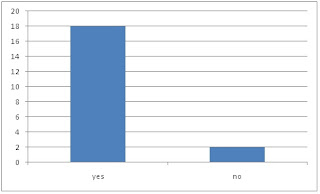
Looking at the results of question 2 that local newspapers should consist of a variety of different subject matters, I would have changed the subject matter of my newspaper to one that covers a variety of different subjects, possibly local entertainment because this would allow me to include much more material in the newspaper and the website for example information about local events and festivals, reviews for local theatre and films at a local cinema plus the content that I have already included about music.
3. What subject matters are usually covered in your local newspaper?
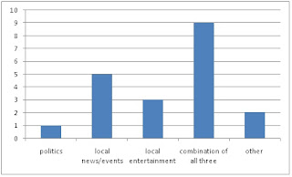
Looking at question 3 gives me the same conclusion as looking at the results of question 2, that i should have given my newspaper a variety of subject matters that are related to the community, possibly looking at local news and events and entertainment. I wouldn’t want to add politics because I don’t think that it would blend well with the other subjects and i feel that any subject matter covered in a newspaper should in some way link in some way to the other subject matters.
4. Would a local music newspaper interest you?
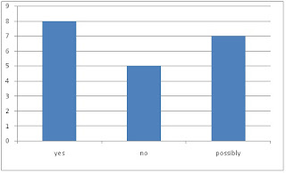
I think that the results for this question has come out positively simply because there are very few music newspapers in this area. If this were to be a published newspaper it would allow me to fill a gap in the current media market.
5. What type of newspaper would you consider this product to be?
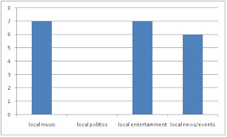
The results of question five show me that the people I asked thought that my magazine could have either been a music or entertainment magazine. This could be true because I have noted that a festival guild would be later in the magazine. However if I were to do this again I feel that I would make it an entertainment magazine because it would cover a wider range of subjects such as film and local vents as well as music. This would allow me to have a different variety of articles such as reviews that I could have in the newspaper as well as on the website.
6. What do you think the age group for the target audience would be for this product?
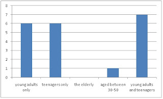
Looking at the results of question six suggests that the people I asked thought that my newspaper was majorly for young adults and teenagers as well as for teenagers only and young adults only indicating that the appearance and content of my newspaper was appealing to my target audience of adults and teenagers.
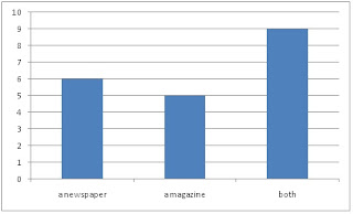
7. Do you think the layout of this product is typical of either?
8. Do you think the layout and the overall appearance of this product is aesthetically pleasing?
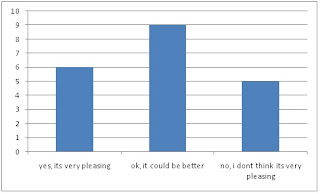
I agree with the results of question 8 because I do think that my media product could have looked better, if I had the chance to do this again I would have taken more time to organise taking photographs for the product because if feel that some of the photographs that I took didn’t look professional enough, I think that I would have preferred to take some of the photographs in a completely controlled environment so that factors such as the wind or other people couldn’t change the outcome in anyway. I think that having a better quality photograph would allow me to have a better quality layout overall making the appearance of my product look comparable if placed next to a real media product.
9. What is the appropriate price for a product like this, if any?
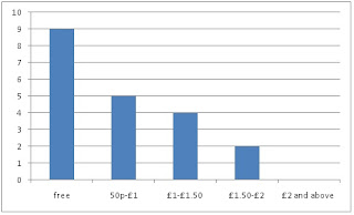
Again I agree with the result of this question, because after looking at some of the local newspapers in my area the conclusion that I have made is that the majority of them are free, making their profit from advertisements and I feel that I should do the same thing. And because if this was a real media product I would distribute it in local colleges, music stores and venues I don’t believe that it would be a product that people would expect to pay a large amount for, if anything.
To create my media products I used three computer programmes; Photoshop, Indesign and Dreamweaver. I used Photoshop to edit images that I wanted to use in each of the tasks, this included cropping images and editing the appearance of the images.
For example I edited one picture rather dramatically so I could use it both on the front of the newspaper and on the poster.
This was the original photo that I used on the front of the newspaper.
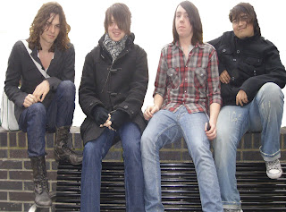
And this is the edited image, editing this image allowed me to create a new media product however using the same material that i already had, saving time. It also allowed me to create the product that i wanted because i felt that the original image simply placed on the poster looked very square and unprofessional, editing the image allowed the overall image flow better and have a similar effect to that of some of the magazines i had looked at. See ancillary tasks post.
Tuesday, 20 April 2010
ancillary tasks
POSTER
when doing a simple search on google for posters for a newspaper or magazine i found that very few useful images came up, so instead i looked closely at the front covers of magazines, which can look very much like posters. Examples can be seen in my magazine research.
For the poster i wanted it to be simple however have all the information that i needed on it as well as some sort of picture.
This is a sketch of a few ideas that i had for the poster; the first idea was to create an image using the four individual photos i had taken of each member of the band similar to the icon blur album cover.
However i found that when i tried to place the text and information that i wanted onto this background images there were too many different colours so the text couldn't be seen clearly enough.
I like the way that the main image over laps some of the text and the title of the newsaper i believe that this makes the image and the information blend well and is something i want to use for my poser.
From looking at magazines covers i decided to use a band picture on the poster one that i used in the magazine, at the bottom of the poster and have the logo and text and information above it however i felt that this didn't look very professional and the poster as an image had too many straight edges and that the information and image didn't blend very well.
To solve this i edited it in photoshop to get rid of the background and only showing the band and what they were sitting on, this allowed me to more easily layer the text that i needed, it also allowed the text to be visible which it wouldn't have been due to the different contrasts in colours in the background in idea 1 and how the photo of the band was displayed in idea 2.
WEBSITE
when looking for examples to base ideas from for the website i again looked at magazine websites because i felt that newspaper websites were very informative and i don't think that this aspect of a newspaper appeals to my target audience however the websites of magazines are informative in a way that would be appealing to my target audience as well as being entertaining.
I think that the main difference between the newspaper website and the magazine website is the use of images, although there is relatively the same amount of text the use of images, videos and nme radio on nme.com appeals to my target audience and is something that i want too try to duplicate on a simpler level.
For the first idea for the layout of my website i took alot of inspiration from the NME website, i liked to large and artist photographs as well as the videos and music players however because of my limited knowledge i didn't know how to ad a music player and with a limit time constraint i would be able to create a video and put it onto the website.
i think that this layout is more appropriate because i can use much of my existing content that i have already used in the newspaper which creates a link between both the newspaper and the website and because of the way i want this idea to be layed out it is easy to navigate.
Basic layout of my website
Home page
Artists page
content
Newspaper content
For the content of my newspaper i primarily looked at magazines for examples because i dont think many of the national and local newspapers are catered for my target audience.
I took many aspects and ideas for content from kerrang magazine this is because this is a magazine that i regularly read myself but also has a very similar target audience that i have set for my own newspaper.
The main articles in my newspaper were a gig review which feature heavily in kerrang but also an article that is more relevent to a local audience which was the best place to find live music in southend. Both of these articles could appeal to my audience in some way, one being of entertainment value and the other that is more informative.
Gig review
Social Silence is an upcoming band, consisting of four college students(Brad Winter vocals and guitar, Liam Chesher guitar, Connor Tillet bass and Tom Kanini drums) who played at Saks Underground on Saturday 27th February. The entrance fee costing only £3 was pennies compared to the experience of seeing a live band play and although this band is only known to a hand full of people the venue was packed for their very first performance. Although admittedly the band was nervous their performance showed otherwise, their performance was of professional quality and it looked as though they had a great time in the process. The band performed three songs, two covers of blink 182’s ‘All the small things’ and ‘Stay together for the kids’ which got the crowd going and one of their own songs ‘Not gunna’ which sounded fantastic. This added to cheap drinks and a unique atmosphere made a great night out and something that I would defiantly recommend.
Live music in southend
There is always a variety of different places to experience live music in Southend however its choosing the best place for you which is the problem. For those who like rock, punk and alternative genres of music there are plenty of places that you can go. Many pubs in Southend have live bands playing in the early evening; Chinnerys, Saks Underground and many of the pubs on the sea front have some of the greatest live music, with upcoming bands playing and even some well known bands going back to where they started off. These have included bands such as the stereophonic and the automatic. In this economic climate everyone is worried about money however a night out at these venues won’t break the bank, with upcoming bands being no more than £5 and more well known bands being no more than £10 your be able to have a great night out without having to do some overtime at work with a hangover, which is great for everyone.
The rest of the content was to fill column space on the front cover of the newspaper, the festival guide still being relevent to my target audiences and the this week in who article telling the reader what was going to be further in the newspaper.
In this week’s issue of WHO we have the latest gigs and artist, including events from Saks Underground, Chinnerys, The Mill and more. Find out the best place to here live music in Southend and with the summer music festivals coming up, get the essential guide to your festival needs. Social Silence feature and a chance to win some Atticus goodies.
Festival guide
Festivals can be difficult at the best of times; the bad weather, the mud and the drunken nights however it doesn’t have to be all bad. With the write equipment and the no how you’ll come out of your festival feeling like you’ve experience something great. To find out and get all the information that you need to survive your festival experience and have one of the best summers of your life turn to page 7.
I also added a small interview about what people sed about the gig which i took from kerrang magazine which asked people what they thought about the gig.
HOW WAS IT FOR YOU?
EMMA
“It was really good! I thought the venue was ideal for the bands playing there and there was an awsome turn out. The band social silence were amazing, i would so pay to see them again, they sounded professional, they were hot stuff!”
BRAD
“The first gig went rather well in my opinion. Although it was very nerver racking playinging with a band on stage for the first time, it was a totally differnt and new experience, which i now crave to do again and again, i love the thrill of it!”
EMILY
“was a fun night out with lots of talented musicions. i would definatly go again.”
i also displayed this in a different way so that it was more noticable to the reader.
Website content
I wanted to use similar or the same content on the website as on the newspaper creating a link between the newspaper and the website, i have viewed this on many newspaper and magazine websites, i believe the main purpose of this to be if a consumer cant buy the product they can easily view the same content on the internet.
This week
In this week’s issue of WHO we have the latest gigs and artist, including events from Saks Underground, Chinnerys, The Mill and more. Find out the best place to here live music in Southend and with the summer music festivals coming up, get the essential guide to your festival needs. Social Silence feature and a chance to win some Atticus goodies.
Live music in southend
There is always a variety of different places to experience live music in Southend however its choosing the best place for you which is the problem. For those who like rock, punk and alternative genres of music there are plenty of places that you can go. Many pubs in Southend have live bands playing in the early evening; Chinnerys, Saks Underground and many of the pubs on the sea front have some of the greatest live music, with upcoming bands playing and even some well known bands going back to where they started off. These have included bands such as the stereophonic and the automatic. In this economic climate everyone is worried about money however a night out at these venues won’t break the bank, with upcoming bands being no more than £5 and more well known bands being no more than £10 your be able to have a great night out without having to do some overtime at work with a hangover, which is great for everyone.
However i also extend some of the content that i started on the newspaper for example the summer festival guide, which on the newspaper was only a teaser and asked the reader to turn to another page however on the website i created the article.
Festival guide
Festivals can be difficult at the best of times; the bad weather, the mud and the drunken nights however it doesn’t have to be all bad. With the write equipment and the no how you’ll come out of your festival feeling like you’ve experience something great. To find out and get all the information that you need to survive your festival experience and have one of the best summers of your life turn to page 7.
Festivals can be difficult at the best of times; the bad weather, the mud and the drunken nights however it doesn’t have to be all bad. With the write equipment and the no how you’ll come out of your festival feeling like you’ve experience something great.
The right equipment is a must for a summer festival; obviously most people know the basic like a tent, sleeping bag, your ticket, however before you even get to that stage the most important thing to consider before you buy your ticket is what festival is best for you? You don’t want to be stuck in a festival that has bands you don’t like or aren’t even your taste for music. Hopefully this guide will help you to choose what festival will suit you so that you have the best festival experience.
V-festival is for those who like a variety of music ranging from rock and pop to R’n’B. This festival is usually considered to be a first timer festival which means that families and young teenagers usually attend this festival.
Reading and Leeds festival is a festival that has a focused music taste usually with bands that can be put in the alternative, rock and metal music genres. This festival is possibly for more mature music lovers with the age of the average festival goers ranging from their late teens to their mid to late 20’s.
For the true festival experience it has to be Glastonbury, with a wide variety of music and variety of people from dozens of different countries, this festival is bound to please anyone and everyone who attends. Because of the variety of different artists that play at this festival you are sure to find at least one artist that you love.
I also created new content for example the artist of the week much, the majority of the content on that page is not in the newspaper.
Artist of the week
This weeks artist of week is Social Silence, view this weeks issue for the Social Silence gig review at Saks Underground.
Social Silence is an upcoming band, consisting of four college students(Brad Winter vocals and guitar, Liam Chesher guitar, Connor Tillet bass and Tom Kanini drums) starting out simply as a college project the group have decided to stay together and try to make it big in the music business.
Brad Winter gives the rhythm to the band, as well as being front man. Although when you first meet the band he is the quietest of the four, this is unrecognizable onstage when a unique confidence shines through. This is possibly shown most profoundly in his ability with the guitar that is only visible during practice sessions or onstage. So if you happen to have the chance to see Social Silence make sure that you compel yourself to appreciate what you are listening to.
Liam Chesher also plays guitar in the band, giving a lively and energetic performance on stage; he is one of the loudest and most confident of the four. Unlike his fellow guitarist Liam gives the basic sound to the bands music playing strong rifts throughout as well as giving the energy to the bands music.
Connor Tillet gives a red hot chili peppers style to the band playing bass. Along with drummer, he helps to keep everyone in line but he also puts his own twist into the bands music. Because of this he has a special eye for great rifts for guitarists conveying his musical ability.
And finally Tom Kanini, who plays drums, keeps the rest of the band in line and on track whilst on stage. His military inspired drums beats gives the band a unique and professional sound allowing them to progress to achieve their dreams to make it big in music.
advertisements
Like the other local newspapers that i looked at i chose to have advertisenets in my newspaper to fill blank spaces. i did this by changing or creating images in photoshop to use as adverts that i put onto my newspaper and my website.
i wanted to use adverts that would be relevent to the content of the paper, and because is is relevent then the audience are more likely to responde to it. I have seen this in kerrang magazine who often advertise new album releases, tours, relevent clothing companies and things that would appeal to an audience possibly not interested in the content however are of a certain age such as orange the mobile phone company or play.com
Examples of advertisements in kerrang magazine
An advert that is relevent to the content of the magazine advertising gigs
An advert that isnt relevent to the content of the magazine advertising a dvd release at play.com
Tuesday, 13 April 2010
images
From looking at local and national newspapers and magazines i can see that each use different types of images in their publication. Because of this i took a variety of different pictures so i could choose which ones were best suited for my newspaper/magazine and which images i could use for the poster and website.
I found that images in magazines are used as a creative process, to make the article or front cover more astetically pleasing; the images are not natural and the people in the photograph are arranged in a way that is pleasing to the eye however images in newspapers are used to demonstrate statistics or information or to give another interpretation of a certain article in the form of a photograph or in some cases a sketch or cartoon.
Types of Photography
Photographic work can be divided into dozens of categories, many with lots of sub-categories. The following list describes some common types of photography.
Aerial, From a plane, helicopter, balloon or other airborne device.
Adventure/Action, Adventure sports, daring feats, etc.
Animal/Pet, Pets and their relationships with humans. Note that the
human content is often as important as the animal.
Architecture, The art of making property appear attractive. Often
involves panoramic photography.
Artistic, Photography in which creative composition is the goal.
Aura, A controversial type of photography which some claim can
photograph a person's aura.
Black & White, Not simply photography without colour, black and white
photography explores shapes, tones and textures. Shadows
and highlights become much more important.
Camera Phone, "Convenience" photography using a mobile phone's built-in
camera. While not the best quality, camera phones have
opened a new world of spontaneous, on-the-spot photo
opportunities.
Commercial, Product shots, advertising, etc.
Documentary, Journalism, Events, Historical, Political, etc.
Event, Concerts, parties, festivals, weddings, etc.
Large Format, For use on posters, billboards, etc.
Kirlian, A type of contact print photography in which an object
touching a photographic plate is connected to a high
voltage source, creating an aura-like image. Often
confused with aura photography.
Macro, The art of photographing very small and/or close-up
objects.
Microscopic, Any technique for photographing objects too small to be
visible to humans.
Modeling, Photographing objects to be converted into 3D models.
Nature, Landscapes, animals, plants, sea, etc.
People, Candid, Family, Fashion, Glamour, Passports & Visas,
Portrait, Pregnancy, School, Sports, Weddings.
Pinhole, Uses the most basic type of camera possible — a box with a
tiny hole to let light in
Scenic, Landscape, Cityscape
Scientific, Any specialized photography used for scientific endeavour,
e.g. electron microscopy photographs, medical photography,
astrophotography, etc.
Sports, The specialized art of shooting people engaged in sports,
games and adventure activities.
Stock, Photographs taken for distribution to other people, for
use in their projects. These photos tend to be quite
generic, e.g. people working, landscapes, places, etc.
Time-lapse, Photographs with a very long exposure, used to illustrate
something happening over time. A popular example is a
street at night with car lights blurred into long lines.
Travel, Photography to showcase locations, illustrate travel
literature, etc.
Urban/Industrial, Emphasizing urban environments.
sourced from http://www.mediacollege.com/photography/types/
Photographs that i took for the newspaper,poster and website.
I used these first three images in a small printed interview asking these people what they thought of the gig and having their response printed below their image. I took this aspect of the newspaper from Kerrang! which often has a small section on a gig review that gives the views of other people who attended to gig. I think that this allows the reader to observe the views of different people other than the writer of the article.
I used these four images as identity images on the artist biography on the website to give the viewer an idea of who i was talking about.
And finally i used these two band photographs throughout each of the tasks; the newspaper, poster and website, this allowed me to have some sort of sonsistancy throughout each of the tasks linking them together.
Tuesday, 19 January 2010
layout
master pages allow me to create a consistant layout throughout the paper without having to repeat myself.
Master page A is the front cover, this is the page of the newspaper or magazine that will never be the same.
Master page B has aspects of the newspaper that are always the same such as the boarder, page number, strap line and where the date would be.
This is a copy of a quick sketch for ideas for the layout of the double spread for the newspaper, which i want the main story to go on, several pictures and a small section for interviews about what people thought about the gig. i took the interview section idea from Kerrang magazine which uses a similar way to give peoples thoughts about gigs.
Recently i have changed the layout of my newspaper, because i felt that this layout had too much white space and i dont think that i used the space effectively. To solve this i reposisioned the logo this allowed me to then move the rest of the content further up the page allowing the content to be less cluttered.
Wednesday, 6 January 2010
typography terminology
Typeface
A typeface refers to a group of characters, such as letters, numbers, and punctuation, that share a common design or style. Times New Roman, Arial, Helvetica and Courier are all typefaces.
Serif Fonts
Serif fonts are recognizable by the small lines at the ends of the various strokes of a character. As these lines make a typeface easier to read by guiding the eye from letter to letter and word to word, serif fonts are often used for large blocks of text, such as in a book. Times New Roman is an example of a common serif font.
Sans Serif Fonts
Serifs are small lines at the ends of character strokes. Sans serif, or without serif, refers to typefaces without these lines. Sans serif fonts are often used when a large typeface is necessary, such as in a magazine headline. Helvetica is a popular sans serif typeface. Sans serif fonts are also common for website text, as they can be easier to read on screen. Arial is a sans serif typeface that was designed specifically for on-screen use.
Point
The point is used to measure the size of a font. One point is equal to 1/72 of an inch. When a character is referred to as 12pt, the full height of the text block (such as a block of movable type), and not just the character itself, is being described. Because of this, two typefaces at the same point size may appear as different sizes, based on the position of the character in the block and how much of the block the character fills.
Baseline
The baseline is the invisible line on which characters sit. While the baseline may differ from typeface to typeface, it is consistent within a typeface. Rounded letters such as "e" will extend slightly below the baseline.
Tracking, Kerning and Letterspacing
The distance between characters is controlled by tracking, kerning and letterspacing. Tracking is adjusted to change the space between characters consistently across a block of text. This may be used to increase legibility for an entire magazine article. Kerning is the reduction of space between characters, and letterspacing is the addition of space between characters. These smaller, precise adjustments may be used to tweak a specific word, such as in a logo design, or a large headline of a story in a newspaper. All of the settings may be experimented with to create artistic text effects.
X-height
The x-height is the distance between the meanline and the baseline. It is referred to as the x-height because it is the height of a lowercase "x." This height can vary greatly between typefaces.
sourced from http://graphicdesign.about.com/od/typographyfonts/tp/basic_type_terms.htm
This information has allowed me to decide what sort of font and typeface that i want to use for different aspects of my publication. Because i wanted to create a publication similar to that of a magazine i will use a san serif font because many of the magazines that i have looked at use this font and appeal to my target audience. Tabloid newspapers, which can often be targeted at the audience of teenagers and young people which is an audience i want to reach, also use a san serif font for their front cover and throughout the rest of the paper.
Subscribe to:
Posts (Atom)