Monday, 30 November 2009

name of the newspaper


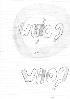
This is an idea for the name of the newspaper that i want to create. The first image is of the first idea i had for the name of the magazine, as i have looked at the rolling stone magazine i thought that it may be appropriate to go along the same lines as that magazine due to the fact that the target audience is similar as well as the content.
However i think that the second image may be more appropriate firstly because it isn’t obvious that iv gone on the same lines as rolling stone magazine but also because it is more appropriate to the content that i intend for the newspaper/magazine, being that i want to promote unsigned bands. "WHO?" emphasises the fact that i want to use unsigned and perhaps unknown, local bands/music acts in the newspaper/magazine.



This is the logo that i created in photoshop
however because i wanted to change the layout for my newspaper i felt that i had to make some changes to the logo. Because i wanted to change how i used the space on the cover on my newspaper i wanted the logo to cover up more white space, to do this i simply added a block of colour behind the logo itself this also allowed me to incorperate the strap line into the logo.

key newspaper terminology

Attribution - A line identifying the source of a quote.
Banner - A wide headline extending across the entire page.
Banner ad - An advertisement stripped across the top or bottom of a Web page.
Bar - A thick rule. Often used for decoration, or to contain type for subheads or standing heads.
Broadsheet - A full-size newspaper, measuring roughly 14 by 23 inches.
Bug - Another term for a sig or logo used to label a story; often indented into the text.
Caption- A line or block of type providing descriptive information about a photo; used interchangeably with cutline.
Column - A vertical stack of text; also called a leg.
Column inch - A way to measure the depth of text or ads; it's an area one column wide and one inch deep.
Filler - A small story or graphic element used to fill space on a page.
Flag - The name of a newspaper as it's displayed on Page One; also called a nameplate.
Gutter - The space running vertically between columns.
Header - A special label for any regularly appearing section, page or story; also called a standing head.
Headline - Large type running above or beside a story to summarize its content; also called a head, for short.
Jump headline - A special headline treatment reserved for stories continued from another page.
Jump line - Type telling the reader that a story is continued from another page.
Layout - The placement of art and text on a page; to lay out a page is to design it.
Quotes - Words spoken by someone in a story. In page-design jargon, a liftout quote is a graphic treatment of a quotation, often using bold or italic type, rules or screens.
Sans serif - Type without serifs: This is sans serif type.
Serif - The finishing stroke at the end of a letter; type without these decorative strokes is called sans serif.
Spread - Another term for a large page layout; usually refers to a photo page.
Subhead - Lines of type, often bold, used to divide text into smaller sections.
Tabloid - A newspaper format that's roughly half the size of a broadsheet newspaper.

sourced from http://highered.mcgraw-hill.com/sites/0072407611/student_view0/glossary.html

research- magazines

I feel that magazines would be more appealing to the target that i want to reach, of teenagers and young adults. I believe that this is due to the content of magazines being very specific, meaning there would be very little in a specifically contented magazine that a person would dislike.
I also think that the layout, and more specifically the front cover is more appealing to my target audience than a newspaper is.


This can be seen through the music magazine 'The Rolling Stone' there is very little text on the front cover, the text that is on the front cover briefly describes the main story of the magazine, as well as a sentence about two other stories that appear in the magazine. This doesn't give a great deal of information, there by wanted the viewer of the magazine to read more. The photograph of Madonna for the front cover is minimalistic which may add appeal to an audience of young adults who remember Madonna in the 1980's which i suspect is when this photograph was originally taken.

Another example of a magazine that i may use as influence and one that i read myself on a weekly basis is Kerrang!


Like The Rolling Stone, Kerrang! uses a full A4 size photograph as the front cover which is an aspect of the magazine which i like however unlike The Rolling Stone,Kerrang! gives more information about the feature article in the magazine as well as information about some minor articles by adding quotes to the front cover, adding smaller photographs and mentioning other bands which accrue throughout the magazine. this is something that i wasn't to add to my own publication because i think that this is a good feature that will create interest to other aspects of magazine.
I also think that the typography that is used for Kerrang! is more relevant to the target audience, the sans serif font that is used is less formal than the serif font that is usually associated with a broadsheet newspaper. For this reason i want to use a sans serif font throught my publication because i feel that this font is more appropiate and appeals more to my target audience.

NME magazine is similar to Kerrang! and The Rolling Stone in the respect that it uses a similar style of front cover.


However it gives information about minor articles different to that of Kerrang! which are displayed in the top right hand corner of the magazine and uses no images.
All three of these magazines convey different degrees of information on the front cover and how much information that i give about the content of the publication on the front cover is something that i need to consider.

research- newspapers

Due to the age of the target audience that i want for the newspaper, i want it to be more like a tabloid newspaper or a magazine rather than a broadsheet newspaper because the layout, size and content of a tabloid newspaper or magazine has always appealed more to a younger audience.
Examples of tabloid newsapers are The Sun, The Mirror and The Star which all use large pictures and healines and often very little or no column text on the front cover.


All of these tabloids have a similar layout that appeals to younger people and is something that i may want to adopt when creating the layout for my own newspaper. Aspects of a tabloid newspaper such as the large photographs as the front cover as well as the large headlines are something that i want to use for my own newspaper or magazine because i believe that these are the key aspects of the layout of a newspaper or magazine that attract my tartget audience of teenagers and young people to buy the product.
Where as broadsheet newspapers have a layout that dont appeal to young people.


This is due to the large amount of column text that is on the front cover, broadsheet papers also tend to be larger than tabloid papers although in recent years the broadsheet paper has become smaller in size. Broadsheet papers also concentrate the majority of there stories on political, economic and bussiness news which the target audience that i want to reach may not be interested in. Although tabloid newspapers do have stories that are based on political or economical issues, many of there stories are based on society or celebrity culture.

LOCAL NEWSPAPERS


the yellow advertiser is similar to both a broadsheet and a tabloid newspaper, it is similar to a broadsheet because of the amount of column text that it has on the cover however it is similar to a tabloid newspaper because of the large picture and headline.
However this local newspaper is different from national newspapers because of the vast amount of advertisement even on the front page, this may suggest that the paper is free or cost little to buy meaning to cover costs the publisher would need to adverts in the paper.


i dont particularly like this layout, i feel that i has too many advertisements, however this may be because the newspaper is free, and articles on the front cover meaning the reader isnt drawn to the main story, they could be distracted by the smaller stories and pther information about whats inside. i dont think that i will base my newspaper on this one simply because of the amount of information that is on the front cover, instead ii will have far fewer adverts and one main story and possibly a small article to give the reader an idea about what will be in the rest of the magazine.

Tuesday, 3 November 2009

project proposal

For this project I wish to create the first two pages of a magazine focusing on the alternative music scene. this will consist of will consist of advertising local music venues such as Chinnerys and the mill, advertising local music acts, teasers of main or other stories in the magazine and other information that would be further on in the magazine. I have also chosen to create a poster for the magazine; this would be to advertise the magazine, as well as its content. Finally I have also decided to create two hyperlinked pages of the magazine’s website, this could give information about the magazine and what it aims to achieve, information about various music acts and venues that couldn’t go into the magazine and further information about previous and upcoming issues.
I want to target the magazine at teenagers and young adults because; being a teenager myself I believe that it would be suitably qualified to know what my target audience would want and expect from an alternative music magazine. This would also allow me to know what sort of content is expected from a magazine that teenagers or young people would read. There are also very few magazines that are specifically targeted at teenagers, this product will allow me to research what magazines are targeted at teenagers and what teenagers want from a magazine that is specifically targeted at them.
This product could be distributed in a variety of different ways; one being through the college, this because the college is the ideal environment because of the age of people who attend, which is the target audience that I wish to attract to the product. Another place where I could distribute this product is in local music venues I think that this would be good because I am able to refine the audience that would be exposed to the product and it allows me to have a higher chance of reaching my target audience, possibly reaching teenagers who have an interest in alternative music. The final way that I could distribute this product is outside related shops to the magazine such as HMV this would allow me to reach the aspect of the target audience who like music.